
The design systems team replaced one versioned package with installable sources. Upgrades went from a two-day chore to a single command per component.
139 React components with keyboard support, reduced-motion fallbacks and real states. Add one with the shadcn CLI and the source lands in your repo, yours to edit.
npx shadcn@latest registry add @netter=https://netter-ui-app-la9g10-924acb-161-153-45-177.sslip.io/r/{name}.jsonEach one opens in the explorer with live props, the full source and its install command.
Each collection keeps its own palette and sample content, so pieces from one set read as a single site. The backgrounds below are Netter components too.
24 components
Cursors, backgrounds, buttons, page sections, cards and logos for product and developer-tool sites, all written for one invented Postgres migration planner.
Drawn with blueprint-grid-bg
21 components
The structural layer under the showpieces: navigation, footers, FAQ and setup content, data display, media, feedback and overlays.
Drawn with topographic-lines-bg
17 components
Specimen pieces built on Motion, GSAP, anime.js, Radix and plain CSS, plus one isolated React Three Fiber scene.
Drawn with ripple-grid-bg
21 components
Cards for dashboards and editorial pages: metrics, timelines, portfolios, presence, payments and reading lists.
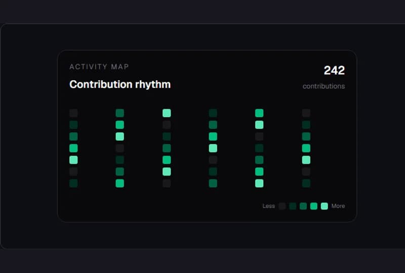
Drawn with dot-matrix-field
13 components
Form-first fields, contact, location and pricing. Controlled or uncontrolled, native name attributes, validation announced in plain sentences.
Drawn with paper-grain-surface
43 components
The original catalog: backgrounds, buttons, heroes, navbars, text effects and the everyday pieces around them.
Drawn with layered-wave-hero-bg
Three steps, the same in every React project with Tailwind v4. Need the namespace setup or another example? Read the installation guide.
Set up shadcn once per project. Skip this if you already have a components.json.
npx shadcn@latest initAdd the component. The CLI installs its npm dependencies too.
npx shadcn@latest add https://netter-ui-app-la9g10-924acb-161-153-45-177.sslip.io/r/async-state-button.jsonWrites components/netter/async-state-button.tsx
Import it like any file you wrote yourself.
import { AsyncStateButton } from "@/components/netter/async-state-button";Every component is a JSON file the shadcn CLI already understands. Open one in the browser, check its files and dependencies, then let the CLI copy it into your project.
components/netter/Source you own and edithttps://netter-ui-app-la9g10-924acb-161-153-45-177.sslip.io/r/registry.jsonhttps://netter-ui-app-la9g10-924acb-161-153-45-177.sslip.io/r/{name}.jsonhttps://netter-ui-app-la9g10-924acb-161-153-45-177.sslip.io/r/async-state-button.jsonDrawn with aurora-mesh-background
The design systems team replaced one versioned package with installable sources. Upgrades went from a two-day chore to a single command per component.